Notice
From release 3.3 onwards, the individual templates (Core, Standardised & Harmonised) can be found on the ECL as configurations of the structurally merged components (Site header, Page header & Footer), which now have a single, dedicated page. Concurrently, the EWG (Europa Web Guide) has also been updated to better accommodate information regarding the optionality of components & elements per site type. Please follow the corresponding links found in the table below for more information.
| Knowledge base | New location |
|---|---|
| EWG (Europa web guide) | Guidelines for EU branded Harmonised sites - Page header(s) |
| ECL (Europa component library) | EU Page header component - Harmonised config. |
The page header component provides users the context of the page. It is always placed just below the site header. There are five variations of the page header. There are five variations of the page header.
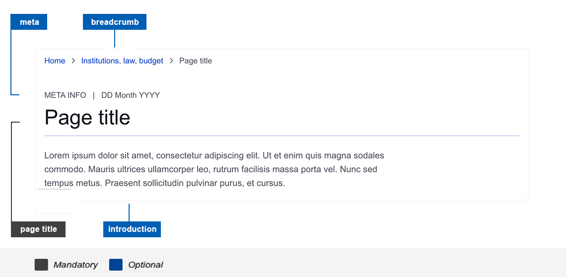
Default as in the anatomy image
Anatomy

| Components | Mandatory | Optional | |
|---|---|---|---|
| Breadcrumb Breadcrumb component provides information on the page and its relationship to the site's hierarchy and structure. It is optional if your website's navigational structure has less than 3 levels. | no | yes | |
| Meta Information related to the page title | no | yes | |
| Page title | no | yes | |
| Introduction | no | yes |
Page header with thumbnail

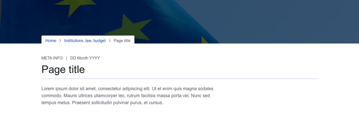
Page header with background image without overlay

Page header background image with light overlay

Page header background image with dark overlay

Do's
- if choosing a background image, make sure it highlights the main object related to the content, and it is clearly visible
Don'ts
- don't use more than one page header per page
- do not choose a background image unless there is a communication need, as it might be a distraction
When to use
- page header can be used on both landing and content pages
- to highlight the page topic, or to show important information about the page
When not to use
- page header is not used for homepage of the website